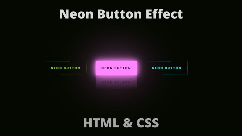
Button Hover in HTML and CSS
In this article, I am going to tell you how you can create a very beautiful Button Hover in HTML and CSS with simple steps. you just need to write a simple code of text to create this HTML Button Hover in HTML and CSS. We will use in this code HTML and simple internal CSS.
first of all, you have to create a folder, where you want to create a save file of code and then drag it or open it on your text editor, after that, you have to save this file by giving any name with the extension name .html.
after saved this file, you just write a simple structure of HTML and create content and follow the code which is given below.
Queries Solved:-
html,css,html css,html tutorial,html css tutorial,css tutorial,html5,html and css,learn html,html tutorial for beginners,html5 tutorial,html course,html for beginners,html and css tutorial,html and css projects,html 5,html crash course,html css ,html css,html css 2021,2021 html css,tuto html css,html css,html css ,html css с нуля,cours html css,html css, html,html с ,html css, html,css,html css project,html css,how to make a website using html and css,html and css,html css project ideas,css tutorial,html css website project,html and css projects for beginners,html css javascript project,html5,html tutorial,html css website design tutorial,html css projects,css project,responsive website html css,how to create a website using html and css,html and css projects,html css projects in urdu,website using html and css
<!DOCTYPE html>

<html>

<head>

<meta charset="utf-8">

<meta name="viewport" content="width=device-width, initial-scale=1">

<title>Button hover effect</title>

<link rel="preconnect" href="https://fonts.googleapis.com">

<link rel="preconnect" href="https://fonts.gstatic.com" crossorigin>

<link href="https://fonts.googleapis.com/css2?family=Poppins:wght@100;300;500;700&display=swap" rel="stylesheet">

</head>

<style type="text/css">

*

{

margin: 0;

padding: 0;

box-sizing: border-box;

}

body

{

display: flex;

justify-content: center;

align-items: center;

height: 100vh;

background: #050801;

font-family: 'Poppins', sans-serif;

font-weight: bold;

}

a

{

position: relative;

display: inline-block;

padding: 25px 30px;

margin: 40px 0;

color: #03e9f4;

text-decoration: none;

text-transform: uppercase;

transition: 0.5s;

letter-spacing: 4px;

overflow: hidden;

margin-right: 50px;

}

a:hover

{

background: #03e9f4;

color: #050801;

box-shadow: 0 0 5px #03e9f4,

0 0 25px #03e9f4,

0 0 50px #03e9f4,

0 0 200px #03e9f4;

-webkit-box-reflect: below 1px linear-gradient(transparent, #0005);

}

a:nth-child(1){

filter: hue-rotate(270deg);

}

a:nth-child(2){

filter: hue-rotate(110deg);

}

a span

{

position: absolute;

display: block;

}

a span:nth-child(1){

top: 0;

left: 0;

width: 100%;

height: 2px;

background: linear-gradient(90deg,transparent,#03e9f4);

animation: animate1 1s linear infinite;

}

@keyframes animate1{

0%{

left: -100%;

}

50%,100%{

left: 100%;

}

}

a span:nth-child(2){

top: -100%;

right: 0;

width: 2px;

height: 100%;

background: linear-gradient(180deg,transparent,#03e9f4);

animation: animate2 1s linear infinite;

transition-delay: 0.25s;

}

@keyframes animate2{

0%{

top: -100%;

}

50%,100%{

top: 100%;

}

}

a span:nth-child(3){

bottom: 0;

right: 0;

width: 100%;

height: 2px;

background: linear-gradient(270deg,transparent,#03e9f4);

animation: animate3 1s linear infinite;

transition-delay: 0.50s;

}

@keyframes animate3{

0%{

right: -100%;

}

50%,100%{

right: 100%;

}

}

a span:nth-child(4){

bottom: -100%;

right: 0;

width: 2px;

height: 100%;

background: linear-gradient(360deg,transparent,#03e9f4);

animation: animate4 1s linear infinite;

transition-delay: 0.75s;

}

@keyframes animate4{

0%{

bottom: -100%;

}

50%,100%{

bottom: 100%;

}

}

</style>

<body>

<a href="#">

<span></span>

<span></span>

<span></span>

<span></span>

Neon button

</a>

<a href="#">

<span></span>

<span></span>

<span></span>

<span></span>

Neon button

</a>

<a href="#">

<span></span>

<span></span>

<span></span>

<span></span>

Neon button

</a>

</body>

</html>
Here we completed our tutorial.
If you face any problem please feel free to contact us.
If you like our article please share it with your friends and relatives.
Thanks for reading our article.
Also Read:-
Website Template HTML CSS | Creative Networks
Mobile Website Template HTML and CSS
Queries Solved:-
html,css,html css,html tutorial,html css tutorial,css tutorial,html5,html and css,learn html,html tutorial for beginners,html5 tutorial,html course,html for beginners,html and css tutorial,html and css projects,html 5,html crash course,html css ,html css,html css 2021,2021 html css,tuto html css,html css,html css ,html css с нуля,cours html css,html css, html,html с ,html css, html,css,html css project,html css,how to make a website using html and css,html and css,html css project ideas,css tutorial,html css website project,html and css projects for beginners,html css javascript project,html5,html tutorial,html css website design tutorial,html css projects,css project,responsive website html css,how to create a website using html and css,html and css projects,html css projects in urdu,website using html and css