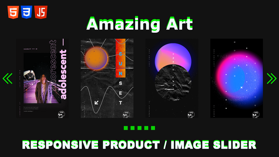
Responsive Product / Image Slider Using HTML, CSS, and JavaScript
In the realm of web development, creating dynamic and engaging user experiences is paramount. One such element that enhances user engagement is a responsive product slider. With the combination of HTML, CSS, and JavaScript, you can craft an immersive and visually appealing responsive product slider that captivates your audience.
In this tutorial, we will guide you through the process of creating a responsive product slider using HTML, CSS, and JavaScript. By the end of this tutorial, you’ll have the skills to implement a stunning slider on your website, delivering a seamless and interactive user experience.

Before we dive into creating the responsive product slider, ensure that you have a basic understanding of HTML, CSS, and JavaScript. Familiarity with these languages will facilitate your comprehension of the concepts and enable you to follow along easily.
Fully Responsive Restaurant Website with HTML, JavaScript & CSS
Step 1 : HTML Structure – Responsive Product / Image Slider
To begin, let’s set up the HTML structure for our responsive product slider. We will use the div element to create a container for the slider. Inside the container, we will have a wrapper for the slider items and additional elements for navigation and pagination. Here’s the HTML code:
<!DOCTYPE html>
<html lang="en">

<head>
    <meta charset="UTF-8">
    <meta http-equiv="X-UA-Compatible" content="IE=edge">
    <meta name="viewport" content="width=device-width, initial-scale=1.0">
    <title>Document</title>

    <!-- custom css link -->
    <link rel="stylesheet" href="style.css">

    <!-- Link Swiper's CSS -->
    <link rel="stylesheet" href="https://cdn.jsdelivr.net/npm/swiper@9/swiper-bundle.min.css" />

</head>

<body>
    <center>
        <h1>Amazing Art</h1>
    </center>

    <div class="swiper mySwiper">
        <div class="swiper-wrapper">
            <div class="swiper-slide slide">
                <img src="1.webp" alt="">
            </div>

            <div class="swiper-slide slide">
                <img src="2.webp" alt="">
            </div>

            <div class="swiper-slide slide">
                <img src="3.webp" alt="">
            </div>

            <div class="swiper-slide slide">
                <img src="4.webp" alt="">
            </div>

            <div class="swiper-slide slide">
                <img src="5.webp" alt="">
            </div>

            <div class="swiper-slide slide">
                <img src="6.webp" alt="">
            </div>

            <div class="swiper-slide slide">
                <img src="7.webp" alt="">
            </div>

            <div class="swiper-slide slide">
                <img src="8.webp" alt="">
            </div>

            <div class="swiper-slide slide">
                <img src="9.webp" alt="">
            </div>

            <div class="swiper-slide slide">
                <img src="10.webp" alt="">
            </div>
        </div>
        <div class="swiper-button-next"></div>
        <div class="swiper-button-prev"></div>
        <div class="swiper-pagination"></div>
    </div>


    <!-- Swiper JS -->
    <script src="https://cdn.jsdelivr.net/npm/swiper@9/swiper-bundle.min.js"></script>


</body>

</html>
Step 2 : CSS Structure – Responsive Product / Image Slider
Now, let’s add some CSS styles to bring our slider to life. We will define the dimensions, positioning, and styling for the slider container, wrapper, navigation buttons, and pagination. Here’s the CSS code:
       *
{
    margin: 0;
    padding: 0;
    box-sizing: border-box;
    font-family: Verdana, Geneva, Tahoma, sans-serif;
    text-transform: capitalize;
}
body
{
    background:#121212;
    overflow-x: hidden;
    padding: 2rem;
}
h1
{
    text-align: center;
    font-size: 4rem;
    color: rgb(9, 241, 1);
    position: relative;
    display: inline;
    margin-bottom: 6rem;
    animation: blink 3s  infinite;

}
h1:after
{
    content: 'Amazing Art';
    width: 100%;
    position: absolute;
    left: 0;
    top: 10%;
    color:aliceblue;


}

.slide
{
    width: 25rem;
    margin-top: 2rem;
    cursor: pointer;
    user-select: none;
}
.slide img
{
    width: 100%;
    aspect-ratio: 2/3;
    object-fit: cover;
}
.swiper-wrapper
{
    margin-bottom: 4rem;
}


.swiper-pagination-bullet
{
    width: 15px!important;
    height: 15px!important;
    border-radius: 0!important;
    background-color: rgb(9, 241, 1)!important;
    animation: blink 3s  infinite;


}


.swiper-button-next,
.swiper-button-prev
{
    color: rgb(9, 241, 1)!important;
    font-size: 10px!important;
    animation: blink 3s  infinite;
}

/* blink animation  */

@keyframes blink
{
    0%
    {
        filter: hue-rotate(0deg);

    }
    20%
    {
        filter: hue-rotate(60deg);
    }
    40%
    {
        filter: hue-rotate(120deg);
    }
    60%
    {
        filter: hue-rotate(180deg);
    }
    80%
    {
        filter: hue-rotate(240deg);
    }
    100%
    {
        filter: hue-rotate(0deg);
    }
}
Step 3 : JavaScript – Responsive Product / Image Slider
To make our responsive product slider functional, we will add JavaScript code that utilizes the Swiper library. Swiper is a powerful and flexible JavaScript library that allows us to create sliders with ease. We will initialize the Swiper instance and configure the desired settings. Here’s the JavaScript code:
var swiper = new Swiper(".mySwiper", {
           slidesPerView: 1,
           spaceBetween: 30,
           pagination: {
               el: ".swiper-pagination",
               clickable: true,
           },
           loop: true,
           autoplay:
           {
               delay: 2500,
               disableOnInteraction: false
           },
           navigation: {
               nextEl: ".swiper-button-next",
               prevEl: ".swiper-button-prev",
           },
           breakpoints: {
               640: {
                   slidesPerView: 2,
                   spaceBetween: 20,
               },
               768: {
                   slidesPerView: 3,
                   spaceBetween: 40,
               },
               1024: {
                   slidesPerView: 4,
                   spaceBetween: 50,
               },
           },
       });
Read More –
Create Filter / Search Product Website By Javascript
Another Website For learn HTML CSS AND JAVASCRIPT LEARN NOW –
Conclusion
Congratulations! You have successfully created a responsive product slider using HTML, CSS, and JavaScript. By following the steps outlined in this tutorial, you’ve learned how to structure the HTML, style the slider with CSS, and incorporate JavaScript functionality using the Swiper library. With your newfound knowledge, you can now implement a captivating and interactive product slider on your website, allowing