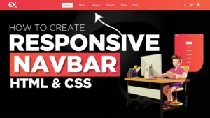
Make Navbar Shrink Effect
In this article, I am going to tell you how you can create a very beautiful Navbar Shrink Effect HTML and CSS with simple steps. you just need to write a simple code of text to create this HTML Navbar Shrink Effect. We will use in this code HTML and simple internal CSS.
first of all, you have to create a folder, where you want to create a save file of code and then drag it or open it on your text editor, after that, you have to save this file by giving any name with the extension name .html.
after saved this file, you just write a simple structure of HTML and create content and follow the code which is given below.
Queries Solved:-
responsive navbar,navbar,navigation bar in html and css,how to create navbar in html and css,navigation bar in html and css responsive,navbar html css,navbar css,css navbar,navbar in html css,responsive navigation bar with html and css,navbar tutorial,navbar in html and css,navigation bar in html,responsive menu bar in html and css,responsive navbar in html css,navbar in html and css in hindi,animated navbar,responsive navbar html css,responsive navbar tutorial,hover effect,css navbar hover effect,css hover effects,menu hover effect,menu hover effects css,navbar hover effect,menu hover effects,css menu
—-embed video here—-
<!DOCTYPE html>
<html>
<head>
<meta charset="utf-8">
<meta name="viewport" content="width=device-width, initial-scale=1">
<title>navbar</title>
<style type="text/css">
*
{
padding: 0;
margin: 0;
font-family: arial;
box-sizing: border-box;
}
#navbar
{
padding: 25px 40px;
position: fixed;
width: 100%;
top: 0;
z-index: 99;
display: flex;
align-items: center;
justify-content: space-between;
background: rgba(255, 255, 255, 0.5);
box-shadow: 10px 10px 50px rgba(0, 0, 0, 0.5);
transition: .4s;
backdrop-filter: blur(5px);
}
#logo
{
color: #000;
font-size: 23px;
width: 200px;
transition: .4s;
text-decoration: none;
}
#navbar ul
{
display: flex;
list-style: none;
width: 300px;
justify-content: space-between;
}
#navbar ul li a
{
text-decoration: none;
color: #000;
}
#navbar button
{
width: 150px;
height: 40px;
border: none;
background: #000;
color: #fff;
cursor: pointer;
}
.hero
{
width: 100%;
height: 100vh;
background: url(https://images.pexels.com/photos/991422/pexels-photo-991422.jpeg?auto=compress&cs=tinysrgb&dpr=2&h=650&w=940);
background-size: cover;
background-repeat: no-repeat;
filter: saturate(10%);
text-align: center;
color: #000;
display: flex;
justify-content: center;
align-items: center;
}
.hero h3
{
font-weight: 100;
letter-spacing: 3px;
}
.hero h1
{
font-size: 180px;
letter-spacing: 3px;
font-family: hakuno;
}
.hero h1~h3
{
background: #fff;
padding: 5px 0px;
width: 400px;
margin-left: 100px;
}
</style>
</head>
<body>
<div id="navbar">
<a href="#" id="logo"><h1>hakuno</h1></a>
<ul>
<li><a href="#">Home</a></li>
<li><a href="#">About</a></li>
<li><a href="#">Contact</a></li>
<li><a href="#">Blog</a></li>
</ul>
<a href="#"><button>Contact</button></a>
</div>
<div class="hero">
<div>
<h3>INTRODUCING</h3>
<h1>hakuno</h1>
<h3>CHIC HANDWRITING FONT</h3>
</div>
</div>
<div>
<p>
Lorem ipsum dolor sit amet, consectetur adipisicing elit, sed do eiusmod
tempor incididunt ut labore et dolore magna aliqua. Ut enim ad minim veniam,
quis nostrud exercitation ullamco laboris nisi ut aliquip ex ea commodo
consequat. Duis aute irure dolor in reprehenderit in voluptate velit esse
cillum dolore eu fugiat nulla pariatur. Excepteur sint occaecat cupidatat non
proident, sunt in culpa qui officia deserunt mollit anim id est laborum.
</p>
</div>
<script type="text/javascript">
window.onscroll = function(){scrollFunction()};
function scrollFunction(){
if (document.body.scrollTop > 30 || document.documentElement.scrollTop > 30)
{
document.getElementById('navbar').style.padding = "20px 40px";
document.getElementById('logo').style.fontSize = "20px";
}
else
{
document.getElementById('navbar').style.padding = "25px 40px";
document.getElementById('logo').style.fontSize = "23px";
}
}
</script>
</body>
</html>
Here we completed our tutorial.
If you face any problem please feel free to contact us.
If you like our article please share it with your friends and relatives.
Thanks for reading our article.
Also Read:-
Create Website Using HTML and CSS || Step-by-Step
Queries Solved:-
responsive navbar,navbar,navigation bar in html and css,how to create navbar in html and css,navigation bar in html and css responsive,navbar html css,navbar css,css navbar,navbar in html css,responsive navigation bar with html and css,navbar tutorial,navbar in html and css,navigation bar in html,responsive menu bar in html and css,responsive navbar in html css,navbar in html and css in hindi,animated navbar,responsive navbar html css,responsive navbar tutorial,hover effect,css navbar hover effect,css hover effects,menu hover effect,menu hover effects css,navbar hover effect,menu hover effects,css menu hover effects,navbar,navbar menu hover effect using html css,navbar css,menu bar hover effect css,css creative menu hover effects,css hover