Loading Animation in HTML CSS
Loading Animation in HTML CSS In this article, I am going to tell you how you can create a very beautiful HTML loading animation effect in HTML with simple steps. you just need to write a simple code of text to create this HTML loading animation. we will use in this code HTML and simple internal CSS.
First of all, you have to create a folder, where you want to create a save you file of code and then drag it or open it on your text editor, after that you have to save this file by giving any name with the extension name HTML.
After saving this file, you just write a simple structure of HTML and create content and follow the code which is given below.
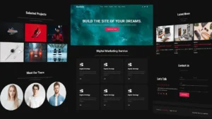
On this website, there is a logo, some headings, paragraphs, a button, and a login form. This website is completely made in HTML and CSS. You can use this website in your work, projects, or others. This Website template is free to use. This website is of a Web design and development company. Every IT Company can use this website template according to their needs and requirements.
Below is the code provided to make this website template. This is a single-page website template that is made in HTML and CSS.
If you want to make changes to this code then you have to simply copy it and paste it into your default text editor and then you can modify this and make changes according to their needs and requirements.
<!DOCTYPE html>

<html>

<head>

<title>Loading</title>

</head>

<style type="text/css">

*

{

margin: 0;

padding: 0;

transition: 0.5s;

background: #262626;

}

.ring

{

position: absolute;

top: 50%;

left: 50%;

transform: translate(-50%, -50%);

width: 150px;

height: 150px;

background: transparent;

border: 3px solid #3c3c3c;

border-radius: 50%;

text-align: center;

line-height: 150px;

font-family: sans-serif;

font-size: 20px;

color: #fff000;

letter-spacing: 4px;

text-transform: uppercase;

text-shadow: 0 0 10px #fff000;

box-shadow: 0 0 20px rgba(0,0,0,0.5);

}

.ring:before

{

content: '';

position: absolute;

top: -3px;

left: -3px;

width: 100%;

height: 100%;

border: 3px solid transparent;

border-top: 3px solid #fff000;

border-right: 3px solid #fff000;

border-radius: 50%;

animation: animatecircle 2s linear infinite;

}

span

{

display: block;

position: absolute;

top: calc(50% - 2px);

left: 50%;

width: 50%;

height: 4px;

background: transparent;

transform-origin: left;

animation: animate 2s linear infinite;

}

span:before

{

content: '';

position: absolute;

width: 16px;

height: 16px;

border-radius: 50%;

background: #fff000;

top: -6px;

right: -8px;

box-shadow: 0 0 20px #fff000;

}

@keyframes animatecircle

{

0%

{

transform: rotate(0deg);

}

100%

{

transform: rotate(360deg);

}

}

@keyframes animate

{

0%

{

transform: rotate(45deg);

}

100%

{

transform: rotate(405deg);

}

}

</style>

<body>

<div class="ring">

Loading

<span></span>

</div>

</body>

</html>
Here we completed our tutorial Website Template in HTML and CSS.
If you face any problem please feel free to contact us.
Thanks for reading our post.
If you like this article then please share it with your friends.
Download Doctor Website Template
Make Our Team Section in HTML and CSS