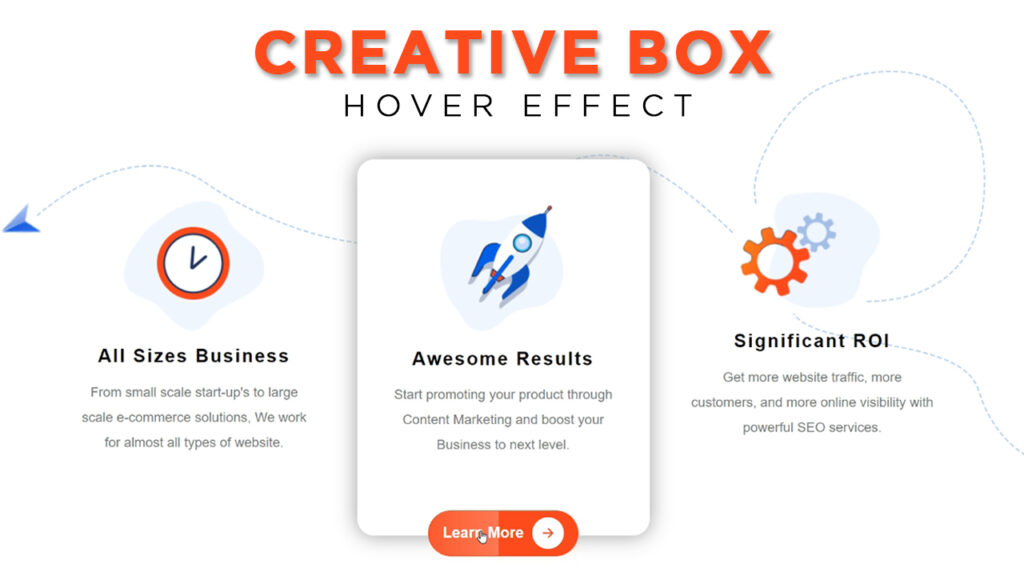
Box Hover Effect in HTML and CSS
In this article, I am going to tell you how you can create a very beautiful Box Hover Effect in HTML and CSS with simple steps. you just need to write a simple code of text to create this HTML Box Hover Effect in HTML and CSS. We will use in this code HTML and simple internal CSS.
first of all, you have to create a folder, where you want to create a save file of code and then drag it or open it on your text editor, after that, you have to save this file by giving any name with the extension name .html.
after saved this file, you just write a simple structure of HTML and create content and follow the code which is given below.
Queries Solved:-
css hover effects,box hover effects,how to create content box hover effects,content box with hover effects,hover,css content box hover animation,box with hover effects using css,css image hover effect,hover effects,div hover effects,css hover,css content box hover effects,css effects,css card hover effect,hover effect,html css hover effects,card hover effects css,css image hover effects,css hover effect,css hover effects tutorial,content box hover effects,hover box,card hover effectscss hover effects,css effects,html css hover effects,css image hover effect,css,card hover effects css,css image hover effects,css hover effect,css hover,box hover effects,css content box hover animation,hover,image hover effects with html and css,css hover effects tutorial,css hover animation,hover effects,how to create content box hover effects,image hover effects,css card hover effect,css hover tutorial,css card hover effects,image hover effects in html,css creative box hover effects,tohana,creativenetworks,best computer center in tohana,computer center in tohana, best institute in tohana,creative networks tohana,website designing,web design in tohana,creative,networks,o-level computer course,tohana best institute,creative networks computer center
<!DOCTYPE html>

<html>

<head>

<title>hover box</title>

<link rel="stylesheet" type="text/css" href="style.css">

<script type="module" src="https://unpkg.com/[email protected]/dist/ionicons/ionicons.esm.js"></script>

<script nomodule src="https://unpkg.com/[email protected]/dist/ionicons/ionicons.js"></script>

</head>

<style type="text/css">

@import url('https://fonts.googleapis.com/css2?family=Red+Hat+Display:wght@400;500&display=swap');

*

{

padding: 0;

margin: 0;

font-family: 'po', sans-serif;

}

body

{

width: 100%;

height: 100vh;

display: flex;

align-items: center;

justify-content: center;

background-color: #ffffff;

background: url(arr.png);

background-repeat: no-repeat;

background-size: contain;

}

.box

{

width: 350px;

height: 450px;

background-color: transparent;

text-align: center;

box-sizing: border-box;

padding: 30px;

border-radius: 20px;

transition: 0.5s;

margin-right: 20px;

cursor: pointer;

position: relative;

}

.box:hover

{

box-shadow: 0px 0px 25px #999999;

background-color: #fff;

}

.box h2

{

font-size: 22px;

font-weight: 700;

letter-spacing: 2px;

}

.box p

{

font-size: 16px;

font-weight: 400;

line-height: 30px;

color: #7a7a7a;

padding-top: 15px;

}

.box button

{

width: 180px;

height: 55px;

border-radius: 40px;

border: none;

margin-left: 20px;

color: #fff;

font-weight: bolder;

background-color: #fe4c1c;

font-size: 18px;

border: 1px solid #fe4c1c;

cursor: pointer;

box-shadow: 12px 12px 20px 0 rgb(254 76 28 / 30%);

transition: 0.5s;

position: absolute;

overflow: hidden;

padding: 1px;

top: 480px;

left: 65px;

display: flex;

justify-content: center;

align-items: center;

visibility: hidden;

}

.box button:before

{

content: '';

position: absolute;

width: 70%;

height: 55px;

top: 0;

transition: .8s;

left: -150%;

bottom: 0;

background: linear-gradient(to left, rgb(255 255 255 / 25%), transparent);

}

.box button:hover

{

box-shadow: none;

}

.box button:hover:before

{

left: 70%;

}

.box:hover button

{

position: absolute;

top: 420px;

left: 65px;

transition: 0.5s;

visibility: visible;

}

.box ion-icon

{

background-color: #fff;

padding: 10px;

border-radius: 50%;

color: #fe4c1c;

margin-left: 10px;

}

</style>

<body>

<div class="box">

<img src="1.png">

<h2>All Sizes Business</h2>

<p>From small scale start-up's to large scale e-commerce solutions, We work for almost all types of website.</p>

<button>Learn More <ion-icon name="arrow-forward-outline"></ion-icon></button>

</div>

<div class="box">

<img src="2.png">

<h2>Awesome Results</h2>

<p>Start promoting your product through Content Marketing and boost your Business to next level.</p>

<button>Learn More <ion-icon name="arrow-forward-outline"></ion-icon></button>

</div>

<div class="box">

<img src="3.png">

<h2>Significant ROI</h2>

<p>Get more website traffic, more customers, and more online visibility with powerful SEO services.</p>

<button>Learn More <ion-icon name="arrow-forward-outline"></ion-icon></button>

</div>

</body>

</html>
Here we completed our tutorial.
If you face any problem please feel free to contact us.
If you like our article please share it with your friends and relatives.
Thanks for reading our article.
How to Download and Install Window 11 for free [ 100% trick ]
Install Wamp Server Without Error – How Can Install Wamp Server In Windows 10 | Pc | Without Problem
Queries Solved:-
css hover effects,box hover effects,how to create content box hover effects,content box with hover effects,hover,css content box hover animation,box with hover effects using css,css image hover effect,hover effects,div hover effects,css hover,css content box hover effects,css effects,css card hover effect,hover effect,html css hover effects,card hover effects css,css image hover effects,css hover effect,css hover effects tutorial,content box hover effects,hover box,card hover effectscss hover effects,css effects,html css hover effects,css image hover effect,css,card hover effects css,css image hover effects,css hover effect,css hover,box hover effects,css content box hover animation,hover,image hover effects with html and css,css hover effects tutorial,css hover animation,hover effects,how to create content box hover effects,image hover effects,css card hover effect,css hover tutorial,css card hover effects,image hover effects in html,css creative box hover effects,tohana,creativenetworks,best computer center in tohana,computer center in tohana, best institute in tohana,creative networks tohana,website designing,web design in tohana,creative,networks,o-level computer course,tohana best institute,creative networks computer center