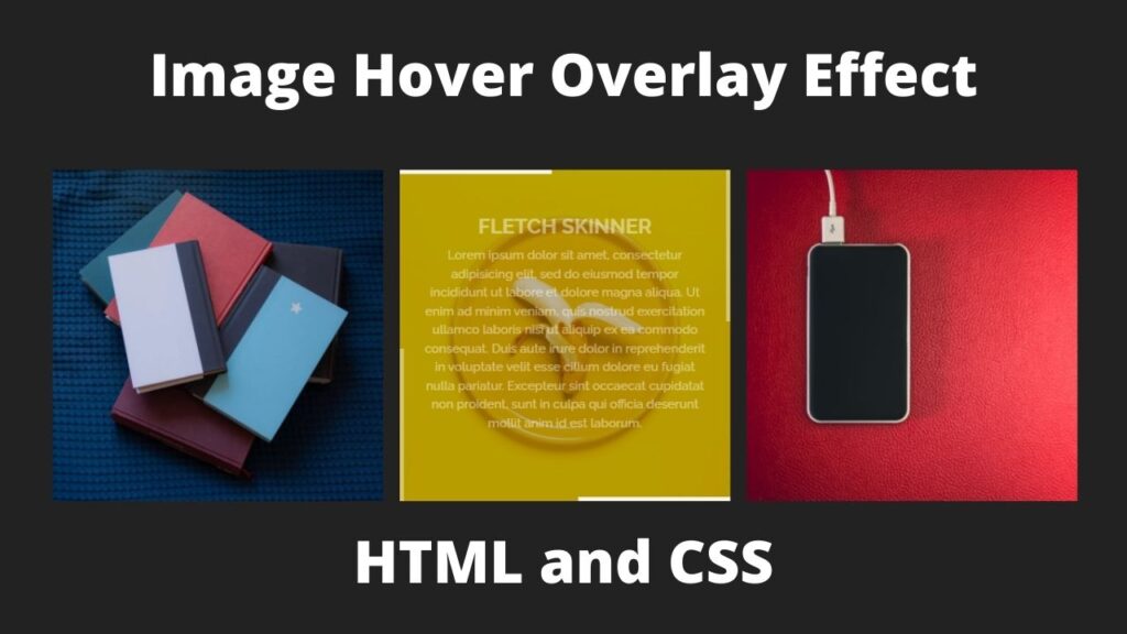
Image Hover Overlay Effect CSS
In this article, I am going to tell you how you can create a very beautiful Image Hover effect CSS with simple steps. you just need to write a simple code of text to create this HTML Image Hover effect CSS. We will use in this code HTML and simple internal CSS.
first of all, you have to create a folder, where you want to create a save file of code and then drag it or open it on your text editor, after that, you have to save this file by giving any name with the extension name .html.
after saved this file, you just write a simple structure of HTML and create content and follow the code which is given below.
Queries Solved:-
best computer center in tohana,computer center in tohana, best institute in tohana,creative networks tohana,website designing,web design in tohana,creative,networks,o-level computer course,tohana best institute,creative networks computer center, html,html tutorial,html5,learn html,html tutorial for beginners,html css,html course,html for beginners,html css tutorial,html,html5 tutorial,introduction to html,html 5,html crash course,.html,html elements,html,html tags,html,html ,html за час,html leren,html за 1 час,html basics,html coding,html (programming language),html,html html html,html nederlands,html, css,css tutorial,html css,css tips,css grid,css crash course,css for beginners,css course,learn css,css beginners,css tutorial for beginners,css,css 2020,css animation,css hindi,css 3,css preparation,css tricks,css em,css vh,css vw,3d css,css desde cero,css rem,css,css all,css transition,tutorial de css,css full course,css course for beginners,css 2021,учим css,grid css,css,css,css, Image Hover effect CSS, Image Overlay Effect CSS.
<!DOCTYPE html>

<html>

<head>

<meta charset="utf-8">

<meta name="viewport" content="width=device-width, initial-scale=1">

<title>Image Hover Effect</title>

</head>

<style type="text/css">

body

{

width: 100vw;

height: 100vh;

display: flex;

justify-content: center;

align-items: center;

overflow: hidden;

background: #222;

}

.img

{

font-family: arial;

position: relative;

margin: 10px;

min-width: 400px;

max-width: 400px;

width: 100%;

color: #fff;

text-align: left;

background-color: #000;

font-size: 16px;

}

.img *

{

box-sizing: border-box;

transition: all 0.4s ease-in;

}

.img img

{

position: relative;

max-width: 100%;

vertical-align: top;

}

.img figcaption

{

position: absolute;

top: 0;

right: 0;

width: 100%;

height: 100%;

z-index: 1;

opacity: 0;

padding: 20px 30px;

text-align: center;

}

.img figcaption:before,

.img figcaption:after

{

width: 5px;

height: 0;

}

.img figcaption:before

{

right: 0;

top: 0;

}

.img figcaption:after

{

left: 0;

bottom: 0;

}

.img h3,

.img p

{

line-height: 25px;

}

.img h3

{

margin: 0 0 5px;

font-weight: 700;

font-size: 25px;

padding-top: 30px;

}

.img p

{

font-size: 15px;

font-weight: 500;

margin: 0 0 15px;

font-family: arial;

}

.img a

{

position: absolute;

top: 0;

right: 0;

left: 0;

bottom: 0;

z-index: 1;

}

.img:before,

.img:after,

.img figcaption:before,

.img figcaption:after

{

position: absolute;

content: "";

background-color: #fff;

z-index: 1;

transition: all 0.4s ease-in;

opacity: 0.8;

}

.img:before,

.img:after

{

height: 5px;

width: 0%;

}

.img:before

{

top: 0;

left: 0;

}

.img:after

{

bottom: 0;

right: 0;

}

.img:hover img,

.img.hover img

{

opacity: 0.4;

}

.img:hover figcaption,

.img.hover figcaption

{

opacity: 1;

}

.img:hover figcaption:before,

.img.hover figcaption:before,

.img:hover figcaption:after,

.img.hover figcaption:after

{

height: 100%;

}

.img:hover:before,

.img.hover:before,

.img:hover:after,

.img.hover:after

{

width: 100%;

}

.img:hover:before,

.img.hover:before,

.img:hover:after,

.img.hover:after,

.img:hover figcaption:before,

.img.hover figcaption:before,

.img:hover figcaption:after,

.img.hover figcaption:after

{

opacity: 1;

}

</style>

<body>

<figure class="img">

<img src="a.jpeg">

<figcaption>

<h3>Creative Networks</h3>

<p>Lorem ipsum dolor sit amet, consectetur adipisicing elit, sed do eiusmod

tempor incididunt ut labore et dolore magna aliqua. Ut enim ad minim veniam,

quis nostrud exercitation ullamco laboris nisi ut aliquip ex ea commodo

consequat. Duis aute irure dolor in reprehenderit in voluptate velit esse

cillum dolore eu fugiat nulla pariatur. Excepteur sint occaecat cupidatat non

proident, sunt in culpa qui officia deserunt mollit anim id est laborum.</p>

</figcaption>

<a href="#"></a>

</figure>

<figure class="img">

<img src="b.jpeg">

<figcaption>

<h3>Creative Networks</h3>

<p>Lorem ipsum dolor sit amet, consectetur adipisicing elit, sed do eiusmod

tempor incididunt ut labore et dolore magna aliqua. Ut enim ad minim veniam,

quis nostrud exercitation ullamco laboris nisi ut aliquip ex ea commodo

consequat. Duis aute irure dolor in reprehenderit in voluptate velit esse

cillum dolore eu fugiat nulla pariatur. Excepteur sint occaecat cupidatat non

proident, sunt in culpa qui officia deserunt mollit anim id est laborum.</p>

</figcaption>

<a href="#"></a>

</figure>

<figure class="img">

<img src="c.jpeg">

<figcaption>

<h3>Creative Networks</h3>

<p>Lorem ipsum dolor sit amet, consectetur adipisicing elit, sed do eiusmod

tempor incididunt ut labore et dolore magna aliqua. Ut enim ad minim veniam,

quis nostrud exercitation ullamco laboris nisi ut aliquip ex ea commodo

consequat. Duis aute irure dolor in reprehenderit in voluptate velit esse

cillum dolore eu fugiat nulla pariatur. Excepteur sint occaecat cupidatat non

proident, sunt in culpa qui officia deserunt mollit anim id est laborum.</p>

</figcaption>

<a href="#"></a>

</figure>

</body>

</html>
Here we completed our tutorial.
If you face any problem please feel free to contact us.
If you like our article please share it with your friends and relatives.
Thanks for reading our article.
Read Also:-
Calculator in HTML and CSS with Source code
Facebook Website in HTML and CSS
Queries Solved:-
effects,how to create content box hover effects,image hover effects,css card hover effect,css hover tutorial,css card hover effects,image hover effects in html,css creative box hover effects,tohana,creativenetworks,best computer center in tohana,computer center in tohana, best institute in tohana,creative networks tohana,website designing,web design in tohana,creative,networks,o-level computer course,tohana best institute,creative networks computer center, beginners,html css tutorial,html,html5 tutorial,introduction to html,html 5,html crash course,.html,html elements,html,html tags,html,html ,html за час,html leren,html за 1 час,html basics,html coding,html (programming language),html,html html html,html nederlands,html, css,css tutorial,html css,css tips,css grid,css crash course,css for beginners,css course,learn css,css beginners,css tutorial for beginners,css,css 2020,css animation,css hindi,css 3,css preparation,css tricks,css em,css vh,css vw,3d css,css desde cero,css rem,css,css all,css transition,tutorial de css,css full course,css course for beginners,css 2021, Image Hover Overlay Effect.