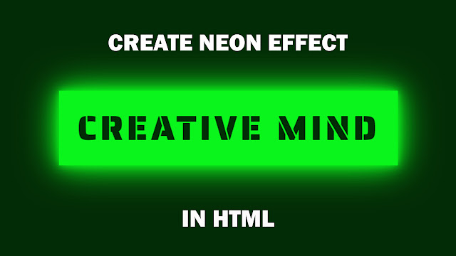
HELLO, GUYS IN THIS ARTICLE I AM GOING TO HOW YOU HOW YU CAN CREATE A VERY BEAUTIFUL NEON EFFECT IN HTML WITH THE HELP OF CSS IN SIMPLE STEPS.
I AM GIVING YOU ALL CODE BELOW AND A VIDEO. YOU CAN WATCH THIS VIDEO AND COPY THE CODE AND APPLY ON YOUR WEBSITE OR YOU CAN CREATE A INTRO VIDEO FOR YOUR YOUTUBE CHANNEL. IT LOOKS GREAT. I HOPE YOU WILL ENJOY IT AND PLEASE LIKE SHARE AND SUBSCRIBE MY YOUTUBE CHANNEL AND MY BLOG.
THANKS GUYS !!!
HOW TO CREATE NEON EFFECT IN HTML WITH THE HELP OF CSS IN SIMPLE STEPS || CODE AVAILABLE
NEON EFFECT
CODE-
HTML Code
<!DOCTYPE html>
<html>
<head>
<title>NEON EFFECT ON CSS</title>
<link rel=”stylesheet” type=”text/css” href=”style.css”>
</head>
<body>
<p>
<span></span>
<span></span>
<span></span>
<span></span>
Creative Mind
</p>
</body>
</html>
CSS Code
@import url(‘https://fonts.googleapis.com/css?family=Saira+Stencil+One&display=swap’);
*
{
margin: 0;
}
body
{
height: 100vh;
background:#022c05;
display: flex;
justify-content: center;
align-items: center;
font-family: ‘Saira Stencil One’, cursive;
}
p
{
position: relative;
padding: 20px 36px;
color: #0af51b;
text-transform: uppercase;
font-size: 70px;
letter-spacing: 6px;
overflow: hidden;
}
p:hover
{
color: #022c05;
background-color: #0af51b;
box-shadow: 0 0 14px #0af51b,0 0 40px #0af51b,0 0 80px #0af51b;
transition-delay: 1s;
cursor: pointer;
}
p span
{
position: absolute;
}
p span:nth-child(1)
{
top: 0;
left:-100%;
width: 100%;
height: 2px;
background:linear-gradient(90deg,transparent,#0af51b);
}
p:hover span:nth-child(1)
{
transition: 1s;
left: 100%;
}
p span:nth-child(3)
{
bottom: 0;
right: -100%;
width: 100%;
height: 2px;
background:linear-gradient(270deg,transparent,#0af51b);
}
p:hover span:nth-child(3)
{
transition: 1s;
right: 100%;
transition-delay: .5s;
}
p span:nth-child(2)
{
top: -100%;
right: 0;
width: 2px;
height: 100%;
background:linear-gradient(180deg,transparent,#0af51b);
}
p:hover span:nth-child(2)
{
transition: 1s;
top: 100%;
transition-delay: .25s;
}
p span:nth-child(4)
{
bottom: -100%;
left: 0;
width: 2px;
height: 100%;
background:linear-gradient(360deg,transparent,#0af51b);
}
p:hover span:nth-child(4)
{
transition: 1s;
bottom: 100%;
transition-delay: .75s;
}
I HOPE YOU WILL LOVE THIS AND WATCH THIS VIDEO TO GET KNOWLEGE ABOUT THIS CODE! THANKS
HOW TO CRACK FILMORA FOR LIFETIME || 2021
Responsive and attractive navbar design with html and css only || Responsive Navbar with source code