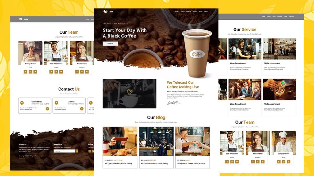
Fully Responsive Restaurant Website with HTML, JavaScript & CSS
In this step-by-step tutorial, we will show you how to create a fully responsive restaurant website using HTML and CSS. From designing the layout to adding interactive features, we’ll cover everything you need to know to build a professional-looking website that looks great on any device. Whether you’re a beginner or an experienced developer, this tutorial is perfect for anyone looking to create a restaurant website or you can use it for you college project also
Creating a website for your restaurant can be a great way to attract new customers and increase sales. But in today’s world, it’s not enough to simply have a website – it needs to be fully responsive, so it looks great on desktop, mobile, and tablet. In this tutorial, we’ll show you how to build a fully responsive restaurant website using HTML and CSS.
Before we begin, you’ll need to have a basic understanding of HTML and CSS. If you’re new to web development, we recommend taking a few online tutorials to get up to speed.
Step 1: Planning and Design
The first step in creating your restaurant website is to plan out the design and layout. Think about what information you want to include on your site, such as your menu, hours of operation, and contact information. Sketch out a rough layout of your site on paper or in a design tool like Adobe XD or Figma.
Step 2: HTML Structure
Once you have a design plan in place, it’s time to start building the HTML structure of your site. Create a new HTML file and add the basic structure, including the head and body elements. Within the body, you’ll want to include a header, navigation, main content area, and footer.
Step 3: CSS Styling
With the HTML structure in place, it’s time to add some styling to your site using CSS. Start by creating a new CSS file and linking it to your HTML file. Next, add styles for the various elements on your site, such as the header, navigation, and main content area.
Step 4: Media Queries
To make your site fully responsive, you’ll need to use media queries. These allow you to change the layout and styling of your site based on the screen size of the device it’s being viewed on. For example, you might want to reduce the font size and hide certain elements on smaller screens.
Step 5: Deployment
Once you’ve completed your site, it’s time to deploy it. There are several ways to do this, such as uploading your files to a web hosting service or using a platform like GitHub Pages. Once your site is live, be sure to test it on multiple devices to ensure it looks and functions as expected.
Building a fully responsive restaurant website can be a bit of a challenge, but with a little bit of planning, HTML and CSS knowledge, you can do it. By following this tutorial, you’ll be able to create a professional-looking website that will help you attract more customers and increase sales.
More tags –
Restaurant website,
HTML and CSS,
Responsive design,
Tutorial,
Step-by-step,
Deployment,
Web design,
Web development,
Restaurant marketing,
Small business website,
Restaurant online presence,
Restaurant website design,
Website building,
CSS3,
HTML5,
Web design tutorial,
Website development,
Website tutorial,
Restaurant business,
Restaurant website development,
Web development tutorial,
Here we completed our tutorial.
If you face any problem
please feel free to contact us.
Thanks for reading our post.
Also Read:
food Website Template HTML and CSS


