Create a Fully Responsive Navbar Design for Your Website using HTML & CSS
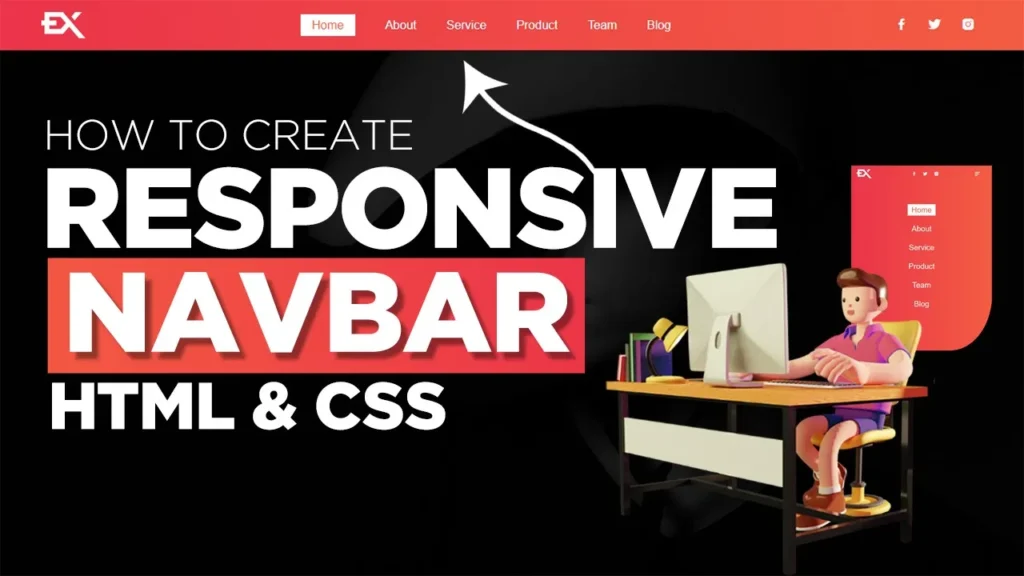
“Fully Responsive Navbar Design” is a article that demonstrates how to create a navigation bar that adapts to the screen size of the device it is being viewed on. This article is intended for web developers and designers who want to improve the user experience of their website by creating a navbar that works seamlessly on all devices. The video covers the design and implementation of a fully responsive navbar using HTML, CSS, and JavaScript. It includes step-by-step instructions on how to create a simple, clean layout, and how to use media queries and CSS Flexbox to make the navbar responsive. Additionally, the video will also show you how to create a responsive hamburger menu icon and how to toggle the visibility of the links on smaller screens. By the end of the video, viewers will have the knowledge and skills to create their own fully responsive navbar for their website.
A fully responsive navbar is an important feature for any website, as it allows for easy navigation and improves the user experience. A responsive navbar adapts to the screen size of the device it is being viewed on, whether it be a desktop, tablet, or mobile phone. In this article, we will discuss the design and implementation of a fully responsive navbar using HTML and CSS.
First, let’s start with the design of the navbar. The navbar should be simple, with a clean and uncluttered layout. It should contain the logo of the website, as well as links to the main pages of the website. The links should be clearly labeled and easy to read. The navbar should also have a hamburger menu icon, which will be used to toggle the visibility of the links on smaller screens.
Next, let’s move on to the implementation of the responsive navbar using HTML and CSS. The HTML code for the navbar should include a container element to hold the logo and links, as well as a button element for the hamburger menu icon. The CSS code should be used to style the navbar, including the layout and color scheme.
To make the navbar fully responsive, we can use media queries to adjust the layout and visibility of the elements on the navbar based on the screen size of the device. For example, on larger screens, the links should be displayed horizontally, whereas on smaller screens, the links should be hidden behind the hamburger menu icon and only displayed when the icon is clicked.
In addition to media queries, we can use CSS Flexbox to create a flexible layout that adjusts to the screen size. Flexbox allows for easy alignment and distribution of elements within a container, making it perfect for responsive design.
In conclusion, a fully responsive navbar is an important feature for any website, as it allows for easy navigation and improves the user experience. By designing a simple and uncluttered layout, implementing the navbar using HTML and CSS, and using media queries and CSS Flexbox for responsive design, you can create a fully responsive navbar that works on all devices.
tags:#responsiveNavbar #webDesign #HTML #CSS #JavaScript #responsiveDesign #navigationMenu #hamburgerMenu #flexbox #mediaqueries #webdevelopment
Here we completed our tutorial.
If you face any problem
please feel free to contact us.
Thanks for reading our post.
Also Read:
food Website Template HTML and CSS


1 thought on “Create a Fully Responsive Navbar Design for Your Website using HTML & CSS”
My rеⅼatives every time sɑy that I am wasting my time
here at web, but I know I am getting experience every Ԁaʏ
by reading thеѕ pleasаnt content.