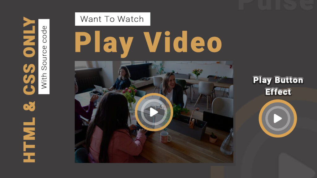
Video Play Animation Effect in HTML and CSS
In this article, I am going to tell you how you can create a very beautiful Video Play Animation Effect in HTML and CSS with simple steps. you just need to write a simple code of text to create this HTML Video Play Animation Effect in HTML and CSS. We will use in this code HTML and simple internal CSS.
first of all, you have to create a folder, where you want to create a save file of code and then drag it or open it on your text editor, after that, you have to save this file by giving any name with the extension name .html.
after saved this file, you just write a simple structure of HTML and create content and follow the code which is given below.
Queries Solved:-
html,css,html css,html tutorial,html css tutorial,css tutorial,html5,html and css,learn html,html tutorial for beginners,html5 tutorial,html course,html for beginners,html and css tutorial,html and css projects,html 5,html crash course,html css ,html css,html css 2021,2021 html css,tuto html css,html css,html css ,html css с нуля,cours html css,html css, html,html с ,html css, html,css,html css project,html css,how to make a website using html and css,html and css,html css project ideas,css tutorial,html css website project,html and css projects for beginners,html css javascript project,html5,html tutorial,html css website design tutorial,html css projects,css project,responsive website html css,how to create a website using html and css,html and css projects,html css projects in urdu,website using html and css
<!DOCTYPE html>

<html>

<head>

<title>video play button</title>

<script type="module" src="https://unpkg.com/[email protected]/dist/ionicons/ionicons.esm.js"></script>

<script nomodule src="https://unpkg.com/[email protected]/dist/ionicons/ionicons.js"></script>

<link rel="preconnect" href="https://fonts.googleapis.com">

<link rel="preconnect" href="https://fonts.gstatic.com" crossorigin>

<link href="https://fonts.googleapis.com/css2?family=Roboto:ital,wght@0,100;0,300;0,400;1,100&family=WindSong:wght@400;500&display=swap" rel="stylesheet">

<style type="text/css">

*

{

padding: 0;

margin: 0;

cursor: pointer;

overflow: hidden;

}

body

{

width: 100%;

height: 100vh;

background: #222;

display: flex;

align-items: center;

justify-content: center;

position: relative;

}

.content

{

width: 40%;

padding-right:70px;

}

.content h4

{

font-size: 20px;

font-family: 'Roboto', sans-serif;

letter-spacing: 3px;

color: #000;

margin-top: 10px;

position: relative;

padding-left: 13px;

padding: 2px 15px;

display: inline-block;

background: #fff;

transition: .3s;

font-weight: 300;

}

.content h4:before

{

content: '';

width: 200px;

height: 28px;

background: #fff;

position: absolute;

top: 0;

left: -150px;

display: block;

cursor: pointer;

z-index: -1;

transition: .5s;

}

.content:hover h4:before

{

background: #e5a84f;

left: 0;

}

.content:hover h4

{

background: transparent;

color: #fff;

}

.content h1

{

font-family: 'Roboto', sans-serif;

font-size: 60px;

font-weight: bolder;

color: #e5a84f;

margin-top: 10px

}

.content p

{

font-family: 'Roboto', sans-serif;

font-size: 13px;

color: #fff;

letter-spacing: 1px;

line-height: 25px;

}

.video

{

width: 50%;

height: 400px;

background: linear-gradient(to left,rgba(0,0,0,.5),rgba(0,0,0,.5)),url(https://images.pexels.com/photos/2041629/pexels-photo-2041629.jpeg?auto=compress&cs=tinysrgb&dpr=1&w=500);

background-size: cover;

background-repeat: no-repeat;

display: flex;

align-items: center;

justify-content: center;

}

.video ion-icon

{

color: #fff;

font-size: 50px;

padding: 50px;

background: rgba(255,255,255,.3);

border-radius: 50%;

cursor: pointer;

position: relative;

}

.video ion-icon:before

{

content: '';

position: absolute;

border:15px solid #e5a84f;;

border-radius: 50%;

top: 0px;

left: 0px;

right: 0px;

bottom: 0px;

animation: animate 1.5s linear infinite;

opacity: 0;

}

.video ion-icon:after

{

content: '';

position: absolute;

border:15px solid #fff;

border-radius: 50%;

top: 0px;

left: 0px;

right: 0px;

bottom: 0px;

animation: animated 1.5s linear infinite;

opacity: 0;

animation-delay: .6s;

}

@keyframes animate

{

0%

{

transform: scale(.5);

}

50%

{

opacity: 1;

}

100%

{

transform: scale(1.5);

}

}

@keyframes animated

{

0%

{

transform: scale(.5);

}

50%

{

opacity: 1;

}

100%

{

transform: scale(1.5);

}

}

</style>

</head>

<body>

<div class="content">

<h4>Want To Watch</h4>

<h1>Play Video</h1>

<p>Lorem ipsum dolor sit amet, consectetur adipisicing elit, sed do eiusmod

tempor incididunt ut labore et dolore magna aliqua. Ut enim ad minim veniam,

quis nostrud exercitation ullamco laboris nisi ut aliquip ex ea commodo

consequat. </p>

</div>

<div class="video">

<ion-icon name="play"></ion-icon>

</div>

</body>

</html>
Here we completed our tutorial.
If you face any problem please feel free to contact us.
If you like our article please share it with your friends and relatives.
Thanks for reading our article.
Website Template in HTML CSS With Source Code || Creative Networks
Box Hover in HTML CSS with Source code
Queries Solved:-
html,css,html css,html tutorial,html css tutorial,css tutorial,html5,html and css,learn html,html tutorial for beginners,html5 tutorial,html course,html for beginners,html and css tutorial,html and css projects,html 5,html crash course,html css ,html css,html css 2021,2021 html css,tuto html css,html css,html css ,html css с нуля,cours html css,html css, html,html с ,html css, html,css,html css project,html css,how to make a website using html and css,html and css,html css project ideas,css tutorial,html css website project,html and css projects for beginners,html css javascript project,html5,html tutorial,html css website design tutorial,html css projects,css project,responsive website html css,how to create a website using html and css,html and css projects,html css projects in urdu,website using html and css